Script Fonts
First of all, Script fonts can fall into two categories: formal script, which is usually so ornamental with flourish s and stuff that the message is illegible, and “Hand” scripts, which usually represent the designer’s vision of handwriting, from elegant to grunge. I think you need two classy, somewhat legible script fonts in your base set, one heavy and one lighter, for wedding and other formal announcements.
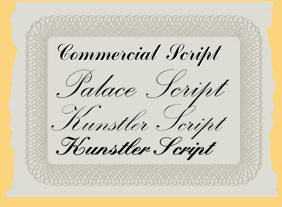
Commercial Script, in one rendition or another, usually comes with any font collection you might see. In fact, the Ford Motor Company uses a modified version of Commercial Script for their logo.
Palace Script is frilly and spidery and if you set a paragraph in Palace Script, your reading audience would storm your castle. However, out of all the formal script fonts I’ve seen, popular and affordable, Palace Script is the “light version” of a Script I use in design work. The staff at Monotype are credited with the design and Kunstler Script (often spelled in the original German URW Foundry’s Kunstlerschreibschrift) is an acceptable substitute and comes in different weights.
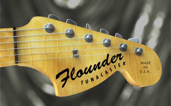
Brush Script is one of the most misused script typefaces on Earth, probably because it’s a “fancy script font, ya know?”, and I’ve seen it rotated at unflattering angles on tow truck services and small business storefront windows since I was old enough to kern text. I actually like Brush Script; if you don’t rotate it or try to do anything clever with it such as extruding or outlining it, it’s a serviceable, relaxed, bold attention-getting font that’s also one of the most legible script fonts. I do believe the Fender guitar company modified the font for use on their signature amps, guitars and bases, because Robert Smith designed Brush Script a full year before Leo Fender started his business, 1945. B. Altman, the Manhattan department store, used Brush Script as their logo before the company ceased in 1989.
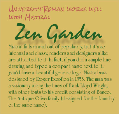
Mistral falls in and out of popularity, but it’s so informal and classy, readers and designers alike are attracted to it. In fact, if you did a simple line drawing and typed a company name next to it, you’d have a beautiful generic logo. Mistral was designed by Roger Excoffon in 1953. The man was a visionary along the lines of Frank Lloyd Wright, with other fonts to his credit consisting of Banco, The Antique Olive family (designed for the foundry of the same name), Calypso—another font like Arnold Boecklin that I adore but absolutely cannot use in a headline, and the free and easy Choc typeface. Just get a copy of Mistral, even a “look-alike” font version. When you’re stuck for a day spa, aromatherapy, or Zen meditative music CD label, Mistral is “Instant Sensitivity”, and I’m sincere, not snarky here. Mistral comes in several weights, a Light version released by ITC is lovely.
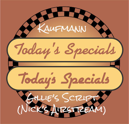
Kaufmann is another hit for the late Max Kaufmann. I’ve seen font lookalikes called “Diner Script” because Kaufman will immediately remind you of the lettering on a 1950s diner menu. It comes in several weights, lookalike font names usually hint that it’s a Kaufmann knock-off, and Kaufman is one of the typefaces that transcends the Retro motif into which it’s frequently cast. And if you absolutely cannot afford a copy of Kaufmann, Nick Curtis has a typeface called Airstream which is in the spirit of Kaufmann, and also a knock off of the commercial Gillie’s Script, less flexible in multiple design situations than Kaufmann.
Blackletter Fonts
If you’re stuck in Sherwood Forest and you need to create a summons for Robin Hood, or if your only client is a Metal band, you’ll probably need a Blackletter typeface. Blackletter fonts range from illegible to highly illegible and their use is limited to tombstones, tombstones of Metal band members, Disney’s Haunted Mansion, and monogrammed cufflinks.
Seriously? You can get plenty of high-quality Blackletter fonts at Dieter Steffmann’s repository. If you want a legible, tame version of a Blackletter font, click here to download a copy of Becker. I like Becker, and you can use Xara’s Mould tool on it so make swooping Renaissance Festival headlines, and your text will remain quite legible.
