

A Tips and Tricks Tutorial By Rik Datta (“Rik” on tg)
Drawing an Invitation Card
Although physical cards can still be found at local stores, the eCard business has positively exploded in the past five years. eCards are immediate, you don’t have to leave the house to send them, and they don’t age over the years.
This month, you’ll see how to draw the “eVitation” card, in perspective so the inside and outside are visible, you’ll learn how to draw the envelope in the proper orientation to the card, and there are a few shadows and reflections you’ll see how to create with the following steps. You’ll see several wireframe quality screen captures in the figures; you might want to copy them to a Xara document and use them for the basis of tracing.If you think of how many occasions this handsome tabletop set-up of the card could be used for—substitute a birthday or an anniversary, then you’ll have learned one artistic approach that can yield several illustrations in the future!
Create the Front of the Card
Figure 1 shows the front-facing part of the folded card. If you’re not totally comfortable drawing a shape like this by eye, you might want to begin with a rectangle and then use the Mould Tool in Perspective mode to make the rectangle appear to angle down at right and look a little larger at top than at bottom. But again, you can use this figure for a reference in Xara
With the Shape tool (or other drawing tool of your liking), click points as indicated in Figure 1 to create path segments between where you click. With the Shape tool, before beginning, make sure the segment properties will be lines and the connecting points will be cusps. The fast way to do this is to choose the tool from the Toolbar, and then press L, and then press Z on the keyboard.
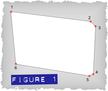
Click points 2, 3 and so on as indicated in Figure 1, and then make a single click back at your original point 1 to close the shape.
For the moment, fill the shape with white colour, and give the shape a 1 px outline width by choosing this from the drop-down on the Infobar. Doing this will make it easy to re-shape two of the path segments.
With the Shape tool, position your cursor over the top right corner segment—the line between points 2 and 3, and then drag the line until it becomes a curve between these points. Repeat this with the line between points 4 and 5. See Figure 2.
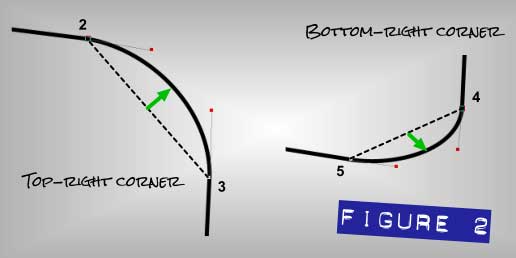
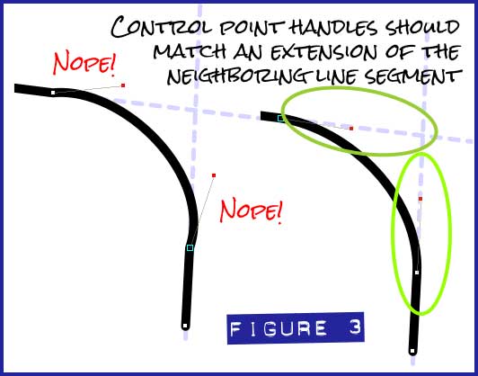
To prevent an awkward-looking bump at the control point that connects the top and right lines in the card, you need to steer the red control point handles, one at a time (using the Shape tool), so that the control line between the control point and the control point handle is perfectly aligned to straight line that precedes it, as shown at right in Figure 3. At left in this figure, you can see that the control lines veer outward from the line that precedes it and there is a discontinuous “hitch” in the path, instead of a smooth transition out of the line and into the curved corner.
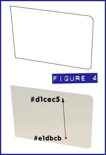
You should now have a shape similar to that shown in Figure 4. Apply a linear gradient fill using the Fill tool and dragging it upwards on the shape while the shape is selected. Use the Color Editor to make the bottom fill handle #e1dbcb, and the top fill handle (click on it with the Fill tool to select it) #d1cec5
Set the outline width to None using the drop down box on the Infobar.
Save your work and keep it open.
Drawing the flip side of the Card
Because the invitation card is made of a single piece of paper, creating and shading the back side uses very similar steps to those you’ve done up to this point.
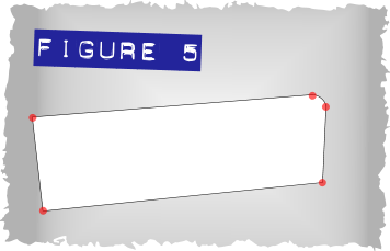
As with the front of the card, use Figure 5 as a guide for creating the back of the folded card.
Using the Shape tool, curve the corner, as you did with the top and bottom right sides of the face of the card earlier. As you can see, you only need to draw part of the back, as most of it is hidden by the front. In Xara drawing work, only draw what’s going to be visible in the finished piece. This could be your greatest time-saver.
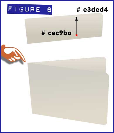
Add a gradient fill the same as you did in Step 6 in the previous section. Click on the bottom fill handle with the Fill tool, and then choose #cec9ba, and then click the top handle to select it and use #e3ded4.
The two pieces need to precisely meet at the upper left corner, as shown in Figure 6. First, move the back of the folded card into position with the Selector tool, and then press Ctrl+B to put the piece behind the front of the card.
The Envelope, Please!
You can’t just send a virtual card through a virtual post office without putting it in a virtual envelope, really! Follow these steps to create the envelope for the invitation card.
Using the Shape Tool, in line and cusp mode, to trace out the rectangle in Figure 7.
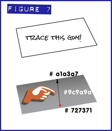
Apply a gradient fill with the following colours: #727371 at the top, #9c9a9a in the middle, #a1a3a7 at the bottom. Now, when you drag with the Fill Tool on the shape, the result is a start fill handle and an end fill handle. To add a fill handle for that middle colour, you double-click on the gradient line connecting the fill handles.
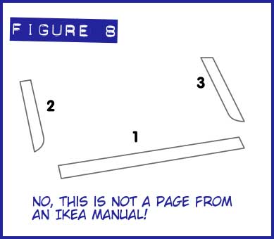
Next, you need the flaps that ordinarily seal the bottom and the sides of the envelope. Trace out the flaps by copying and importing Figure 8 into Xara. Now, it’s very important that you draw the bottom flap first. Doing this ensures that when you bring all the flaps together, flaps 2 and 3 are above flap 1. Every shape you draw in Xara has an order on the page; last-drawn shapes are on the top of a virtual “stack” on the page.
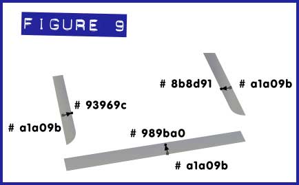
Apply linear gradient fills to each shape as shown in Figure 9 and set line width to none for each shape. Remember that the two side flaps need to be in front (above) the bottom flap.
Position the flaps on top of the main shape with those three gradient points you drew in Step 2.
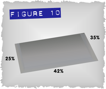
With the Transparency tool, select the flaps one at a time, and while a shape is selected, drag the slider on the Infobar to the amounts shown in Figure 10 (25% for the left flap, 42% for the bottom, and 35% for the right.)
Making the Top Flap
You can’t open the invitation unless the top flap (the one you used to lick before self-sealing envelopes were invented) is at least partially open. This is going to be a visually exciting part of the composition, that adds a sense of depth to your drawing:
Use the shape in Figure 11 as your guide to the outline of the top flap. It’s a little larger and thus out of proportion with the rest of your tracings in this tutorial, but it’s easy to scale your shape down a little.
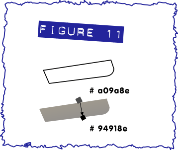
Apply a gradient fill, as shown in Figure 11, and the set the outline width of the shape to None. Now, it’s important that once the flaps are placed on the envelope, make sure that the edges of the flaps don’t go outside of the edges of the envelope, or this effect won’t work well.
Now, because there’s light casting into the scene, and the envelope is partially open, the flap needs a shadow; Trace out the shape in Figure 12, and this figure has an enlarged view too, so you’ll want to scale your work down to be in proportion to the envelope.
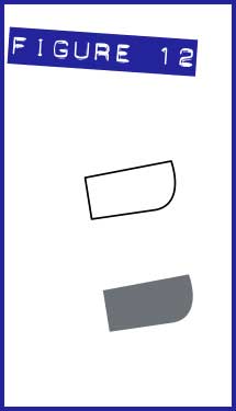
Fill it with colour #131a24, set transparency to 38% and set line width to none. Figure 12 shows the result.
Position the shadow shape over the shape you just created in Step 1 and 2, and align the top right corners over the shape.
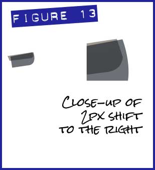
Now move the shadow shape to the right by 2 pixels; the result is shown in Figure 13. If you have your Nudge Distance set up for 1 pixel in Options (Ctrl+Shift+O), all you need to do is hit the right keyboard arrow key twice.
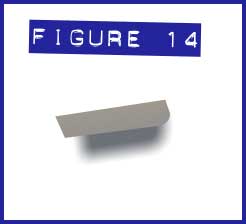
With just the shadow shape selected, press Ctrl+Shift+B to send it behind the flap where it belongs. Figure 14, shows the effect.
Apply 5px of feathering to this shadow shape. The Feather slider’s on the Infobar.
Select both shapes and press Ctrl+G to group them.
Position the flap and shadow over the envelope and align it in the top right corner.
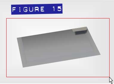
Choose the Selector tool from the Toolbar, and marquee select all shapes and press Ctrl+G to group them. See Figure 15. Save your work!
Suggesting the Envelope is Resting on Something!
The envelope itself needs a shadow; follow these steps to make the envelope appear as though it’s resting on a surface such as a table, or other surface that is mostly parallel with the floor:
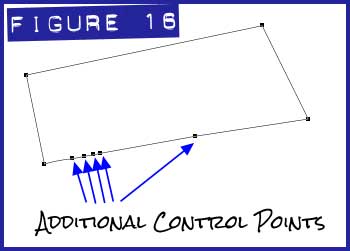
Trace the shape shown in Figure 16. See the points marked ‘Additional Control Points’? You can always add control points to a line segment (or a curve) just by clicking over the segment with the Shape tool.
Set the colour of the shape to white. Doing this lets you to see the outline and makes the next step visually easier to perform.
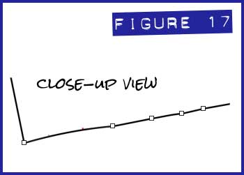
With the Shape Tool, take those additional control points and move them just a little toward the center of the shape, and perhaps make one or two of the segments curved (you do this just by dragging on a segment with the Shape tool). What you’re accomplishing is with this shape which will be a shadow eventually; you’re suggesting that the surface upon which the envelope is resting is not a perfectly flat surface. Little details you pay attention to help create a more convincing illustration! See Figure 17, a close-up of the editing work you should do.
Fill this shape with black and remove any outline width.
Apply 5px feathering to the envelope shadow shape and place it behind the envelope (Ctrl+Shift+B).
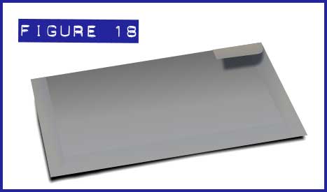
Use your artistic judgment to position this shadow so that it appears that the light source in the scene is from above and just a little to the right. Now, shadows always appear on the opposite side of the object obstructing the light source, so this shadow shape needs to be a little to the left of the envelope; Figure 18 shows a good amount of offset for the shape and it lifts the envelope off the surface it’s resting on.
Marquee all the shapes of the envelope and then press Ctrl+G.
Putting the Card and Envelope Together
Although there’s a little more work to be done, you’ll be very, very pleased with your composition now that it’s time to put the envelope beneath the card, effectively suggesting a third dimension in the drawing as the card is rotated 90 degrees in orientation from the envelope. Let’s get to it!
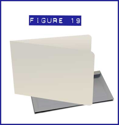
With the Selector tool, place the envelope behind the card; use your own artistic eye to determine the exact placement; Figure 19 is a fair composition. It’s a good composition, but not quite photorealistic because the card isn’t casting a shadow on the envelope. No problem, follow along.
Draw a 3px line; use the Straight Line tool and then type 3 in the outline width field on the Infobar. Make this line black; hold Shift and then click on the black swatch on the color line at the bottom of the UI. See Figure 20.
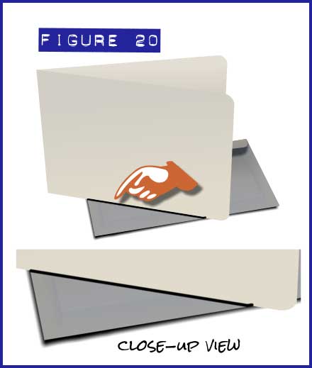
Apply 0.8px feathering to the line and 42% transparency.
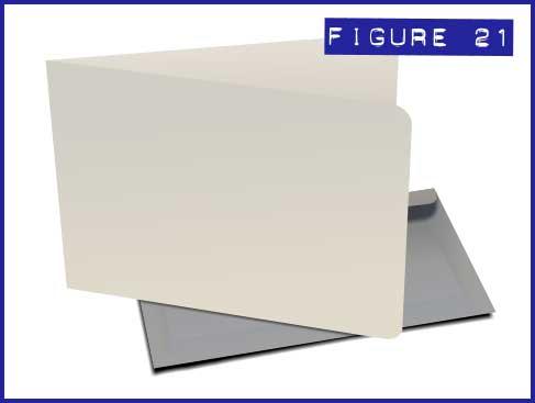
Press Ctrl+Shift+B to put the line behind the card. Use your artistic judgment as to how much of the shadow shows by moving the feathered line perhaps 1 pixel or adjusting the feathering of the thickness of the line. But only part of the shadow should show, and not the whole feather line or the shadow will look unrealistic if its far side is visible. This composition is shaping up dramatically, isn’t it? You might want to hunt in the desk drawer for some postage stamps before too long! See Figure 21.
Two more Shadows from the Card
In addition to casting a shadow on the envelope, the card, if we accept the light source is casting slightly to the right, the should be somewhat of a soft shadow casting on the surface upon which the envelope is resting, at the right bottom edge and also at the left. Let’s tackle the bottom right shdadow first.
Draw a shape as shown in Figure 22.
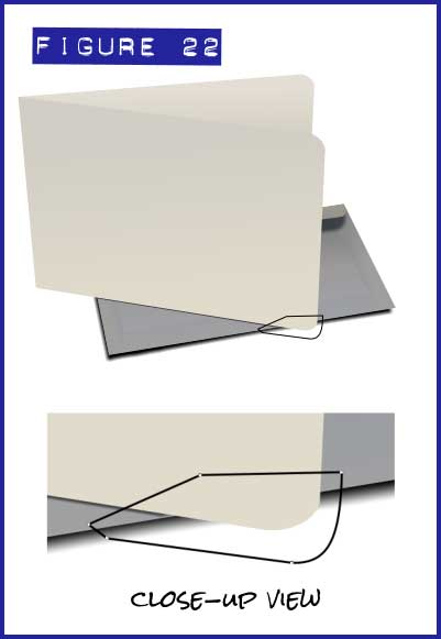
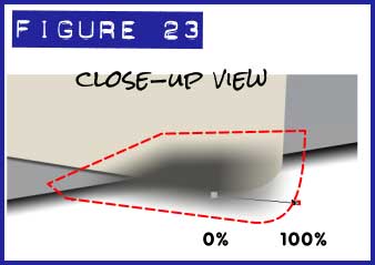
Apply colour #504f4b to this shape, along with 7 px Feathering, and a linear transparency as shown in the close-up in Figure 23. The red dashed outline in this figure is simply a call-out and not an element in your composition. I wanted to show you what the original shape looks like compared to its appearance after feathering. Feathering creates the appearance that the original shape has shrunk.
After you’ve applied the feathering and the transparency, press Ctrl+B to send the piece to the back of the composition.
Ready to create the final shadow?
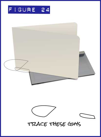
Two more shapes will make up the shadow at the bottom left of the card. Trace both shapes shown in Figure 24.
In Figure 25, the bigger shape should have a solid colour, #736f6a, and it has three transparency values, 100% at 11 o’clock, 78% in the center of the transparency line, and 31% at its origin, which is about 4 o’clock. As with the linear gradient fill, a transparency can have intermediate transparency steps. To get the 78% value, you double-click the center of the transparency line with the Transparency tool and a new handle is created. With this marker selected, you adjust the transparency value on the Infobar. Now, give this shape 12.7px of Feathering using the slider on the Infobar.
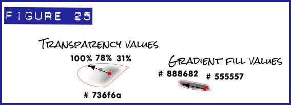
The smaller shape uses a linear gradient fill, from #888682 at left to #555557 at right.
Apply 3.2 px feathering. This figure shows a slight red outline around the shapes, but you won’t see this in your work. They’re merely indicators in this tutorial as to where the original shapes are located and their outline shape.
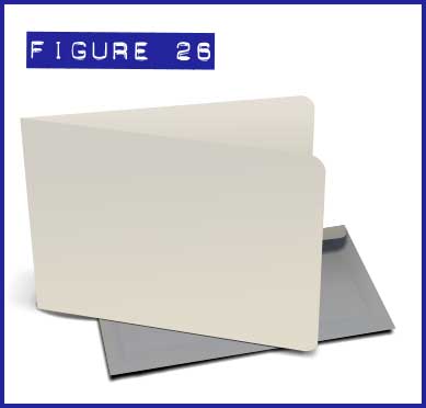
Figure 26 shows what I believe to be the ideal placement for these shapes; you want to put them to back after positioning them (Ctrl+B).
Suggesting a Parchment or Vellum Look
Fancy invitation cards are often printed on translucent paper—you can’t see through them as you would with a pane of glass, but light and shade are definitely transmitted through the substance. So, to make this invitation card look as though it was printed on expensive semi-translucent parchment or vellum, you’re going to put a faint shape on top of the card that suggests you can see a little of the underlying envelope.
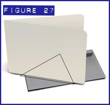
Trace the triangular shape shown in Figure 27.
Apply a linear fill as shown in Figure 28 and set the values as colour #dbd6c9 at the top and #afb3b6 at the bottom.
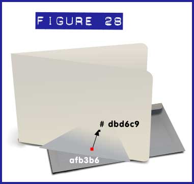
Set the line width of this shape to None. See Figure 28.
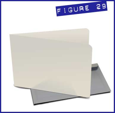
Apply 7.5px feathering and 83% transparency. Your composition will look like Figure 29.
Putting Text on the Invitation
It’s a terrific looking invitation card now. So what’s it going to say? The steps to follow were covered in the July 2013 tutorial: Packaging and Perspective, but I’ll recover these steps in context here:
Draw a rectangle of the shape and size as shown in Figure 30.
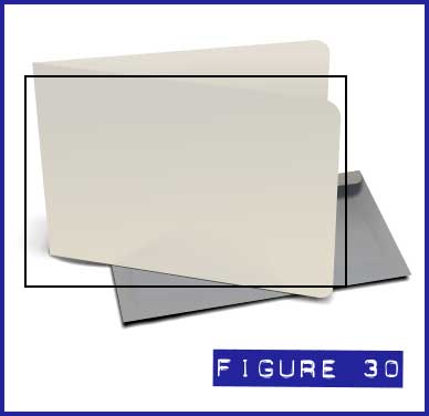
Set the line width to 1px and colour to None (no fill).
This rectangle represents the approximate dimensions of the invitation cards front. Now, to add text and see what you’re doing (!), you might want to move the rectangle away from the composition for the moment.
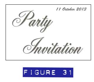
Think of an appropriate statement (“Party Invitation”, “You’re Invited!”, and possibly “Your electric bill is overdue” will surely get attention), and choose a fancy font from your collection. Script fonts are usually formal and elegant, and Font Squirrel offers a wide selection of free typefaces, with more than 50 Script fonts. English and Alex Script are exceptionally attractive. Ancestory SF is used in this example, and it’s free: just do a search by name on the web and you’ll be able to find it. The date you’ll see in Figure 31 uses Brush Script, which just about everyone owns.
In this example, the text colour should be set to #68655c and a subtle Wall shadow is applied. Choose the Shadow tool, and then set the Blur (on the Infobar) to 1.6 pixels, and the Transparency set to 85%. The offset values at the right of the Infobar can be set to X=1 px, and Y= -1 pixels. See Figure 31.
Select all the text, and then from the Arrange menu, choose Convert to Editable Shapes. Ctrl+Shift+S is the shortcut and it’s a very good one to commit to memory when using Xara.
Marquee select all the items for the text part of this composition and then press Ctrl+G to group them.
Put the text group over the invitation card.
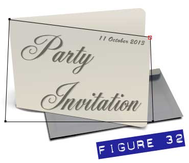
Choose the Mould tool from the Toolbar (the wavy flag icon), and then click Default Perspective on the Infobar, the first one in the second group of buttons.
With the Shape tool (because this is the easiest tool to modify Moulds), one corner handle at a time, line up the corners of the Mouldy text to the corners of the front of the card itself, as shown in progress in Figure 32.
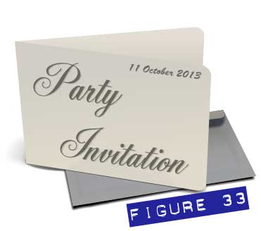
Once you’ve finished moving all 4 corners to the correct position, then set line width to none. Your card is nearly complete. See Figure 33.
The Final Details
Just a little more finessing, and you’ll have yourself a drawing that looks like it’s going to leap off the page…and probably run away to this party (hey, it has the directions).
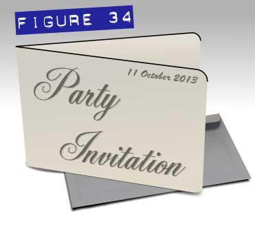
Draw 1.6px line on the front part of the card starting from the left of the card to the right and follow the curve of the corner. This is going to be the very edge of the card—very few things in the Real World have absolutely no depth.
Draw another 1.6px line for the back part of the card. The lines are shown in Figure 34, and actually you can just draw them with the Shape tool and then apply the 1.6px outline width once you’re finished.
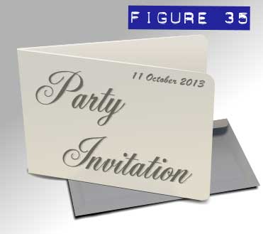
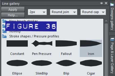
Set line colour to #f3f0ed for both lines and also apply the ‘Iron’ preset from the Line Gallery’s Stroke Shapes and Pressure Profiles category; see Figures 35 and 36.
To finish off your invitation, you might want to add a background, that’s simple so as not to distract from all your work, but interesting and supportive. I used a linear gradient at an angle, running from 40% black just outside the top of the card to white toward the bottom of the fill. You see in photography a lot—sometimes using a milk glass sweep under a product, illuminated from below, when the photographer wants to direct the audience’s attention through the use of light falloff.
Optionally, you might want to put a little text on the front face of the back portion of the card. Try Segoe Script, as it’s quite nice, legible, and comes with Windows. Use 70% black because even black ink doesn’t photograph as 100% black. You can use the Mould tool to skew the text and then if you own Xara 8 or 9, you can use the Eraser tool to remove any text that falls on the front of the card. With previous versions, you can draw a shape whose top edge meets the edge between the front and back of the card, then select the text and the shape, and then choose Arrange, Combine Shapes, Subtract Shapes.
I hope you enjoyed this tutorial, and you should hurry upstairs now to find your tuxedo or gown because I think the party starts soon and it’s across town…
Enjoy!
Be sure to thank Rik for this great tutorial by showing us your invitations or other cards in the Talkgraphics.com thread, September 2013 Tips and Tricks: Drawing an Invitation Card.

(Rik online), TalkGraphics Moderator and member since 2009, says that he has learned the most from other members. Although Rik doesn’t use Xara Designer directly in his job—but rather for personal pleasure, he has used the world’s fastest drawing program to help visualize concepts, flowcharts, and other training collateral material for his 9 to 5 tasks.
Instinctively curious about how the work of others is produced, Rik has quickly become a valued resource on TG for logo design and a slick, sometimes reflective material rendering that has become instantly recognizable by fellow members.
The tutorial Drawing an Invitation Card including the artwork and the downloadable examples file are Copyright © 2013 Rik Datta. All Rights Reserved.