Designer Fonts
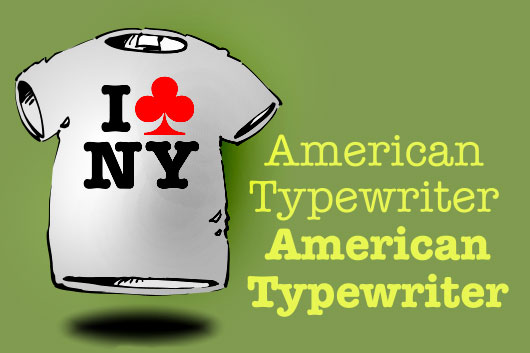
The “term “designer fonts” is one I adopted after acquiring several typefaces that defied a better description. American Typewriter is a classic and it will go way the day the “I (heart) NY” logo does. American Typewriter usually comes in regular and bold, but I’ve seen condensed, black, and italic versions which I feel are ugly and defeat the novel design of a font that’s not really a reproduction of typewriter characters so much as an idealized version; we wish typewriters produced text that looks like American Typewriter. Joel Kaden and Tony Stan took the bow for designing the font in 1974 for International Typeface Corporation (ITC).
Friz Quadrata might look “dated” to you, especially if you have products and brochures from the 1970s. Victor Caruso in 1973 along with Ernst Friz created this font family that was adopted by the Chilean Government for forms, it became part of the logo for the University of Arizona, and schools in North Carolina and Texas use it. The Democratic Party has also used it; Friz Quadrata is “Authority” combined with a fresh modern look that has held up as a pure design winner for 40 years. If you’re a Sci-Fi buff, Friz Quadrata looks different enough from Helvetica and Times Roman to present a futuristic, otherworldly document, and Dr. Pepper used a bold italic version for their logo many years ago.

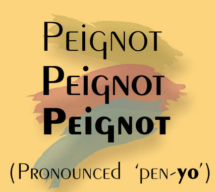
The Peignot family of fonts were originally commissioned for design and created by A. M. Cassandre in 1937. Peignot is a serious study in legibility, proportion, and re-thought lowercase and descender measurements. If you watched The Mary Tyler Moore show decades ago, Peignot is used for the titles. The font sort of went away from the 40s until the 1970s, where it then graced paperback novel covers, and was featured in movies when a hint of Futurism was needed. It’s a decorative font, for sure, but its internal design doesn’t get in the way of your typed message. In fact, it can draw attention to your message without shouting about itself.
I’d consider highly decorative fonts that look like hand lettering from 1930s print ads, and cartoon lettering to fall into a category of Designer Fonts, and yes, I believe you need a few definitively “weird” fonts in your base collection.
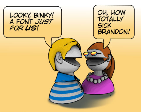
First, Nat Piekos runs Blambot fonts, and here you’ll find every typeface you’d ever need to “hand letter” a comic script, a speech balloon, and a superhero title. Nat generously offers a few free typefaces if you take a tour of his website, and I personally endorse Wild Words, shown here, which suits a lot of different comedic design situations.
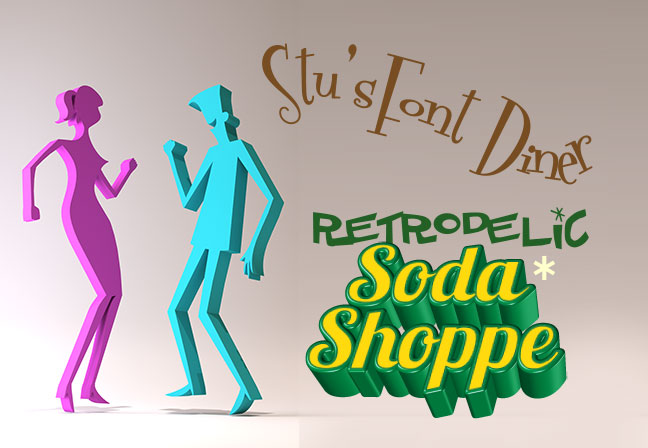
Stu’s Font Diner deals in Retro fonts and they all ring true and are totally delightful to integrate into posters for musicals, fake product ads, and logo work. Stu offers some free typefaces on his website and links to other Retro media vendors. You need at least one of Stu’s Retro fonts for your collection. I can’t tell you how many times I’ve used his font, fontdinerdotcom, in designs. * Pablo Impallari’s Lobster Two is free and open source. Snag a copy of all four styles of Lobster at Google Web Fonts or Font Squirrel.
