
Packaging and Perspective By Gary Bouton (“Gare” on tg)
Packaging and Perspective
Before you begin, download this month’s resource files, open them, and then tuck them away in a safe place for using later.
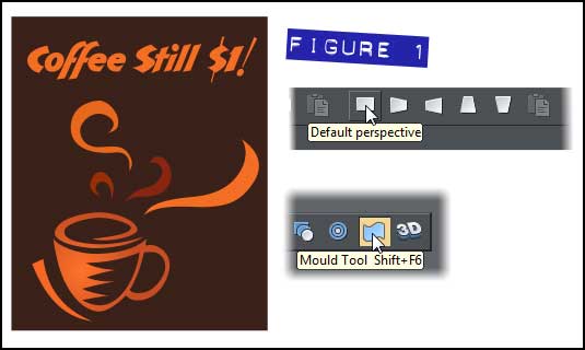
“Perspective”, as it applies to art and drawing, is the suggestion of a third dimension on a flat 2D canvas through the use of foreshortening the height, the width, or both dimensions of an area. Xara Designer offers an easy-to-use feature that helps you add perspective—for example, let’s say you want to make a poster look as though it’s on the side of a wall in a photo—through the Mould Tool’s Perspective features. Figure 1 shows just such an example poster, the Mould tool icon as it appears on the flyout on the Toolbar, and the five modes from which you can choose one at a time.
If you choose the Floor, Ceiling, Left or Right Perspective buttons on the Infobar, you might not always be happy with the severity of the perspective. This is a trade-off, actually, because Xara Designer offers two different ways to apply perspective to shapes: via the bounding box control handles, and also by dragging the vanishing point marker handles around, the round crosshair guys you can see in Figure 2.
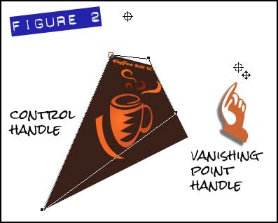
A vanishing point is the point in a scene, be it reality, a photo, or a painting, where two lines that you’re positive are parallel, appear to converge, most often far in the distance. A good example of this is if you stand on a railroad track when you are certain no trains are coming (I take no responsibility for this one, okay?), and peer at them perfectly centered down the track toward the horizon. The only problem with setting vanishing points (one marker for the horizontal parallels of a shape, and one pair for the vertical parallels) is that you often might want a very mild perspective, and not one side of your shape converging at its opposing sides! And this is where, if you drag vanishing points, you might wind up dragging them to a neighboring solar system (or at least off the page) before you get the subtle perspective effect you desire.
All of which is no problem if you seek the more subtle, artistic effect of a label on the side of a package (hint: this is what this month’s tips ‘n’ tricks tutorial is all about) in a photo. You first need to define a rectangle that roughly approximates the front dimensions of the package you want to add a label to, and then you position the label within the rectangle. The final step is to group the rectangle and label, use the Mould Tool’s Default Perspective mode, and then line up the four corners, as you’ll work through, as follows:
Putting a Label on a Photo of a package
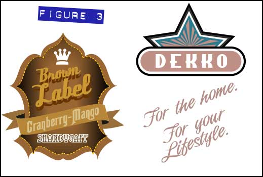
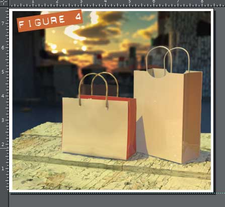
As you can see in Figure 3, I’ve given you two nice but sort of generic labels in the Example Labels.xar file. You don’t have to use them if you have a label of your own that would look good on the bag image (Bags need labels.xar, also in the zip archive you downloaded, see Figure 4).
Let’s use the Brown Label shandy label to put on the front of the left bag, because why not? Follow these steps:
- Select the label from the Example Labels file with the Selector tool, and then press Ctrl+C to copy it to the Clipboard.
- Click over to the Bags need labels document. If you’re using an earlier, non-tabbed page version of Xara, you can alternative use the Windows keyboard shortcut of Ctrl+Tab. Press Ctrl+V to paste the label on top of the locked image and then move it away from the left bag so you have a clear view of the space in which you’ll work.
-
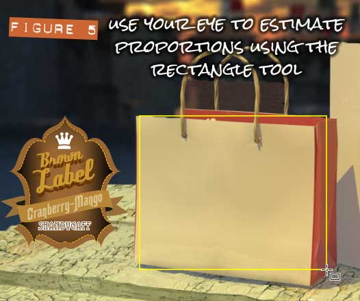
Choose the Rectangle tool from the Toolbar, and then begin your diagonal click+drag at the top left of the bag’s front face. Drag down and to the right, and overshoot the width a little, and under-shoot the height. This is perhaps the hardest step to perform in this example because you really need to use your artist’s eye to estimate the dimensions of a flat plane in perspective when it is viewed without perspective. Give the rectangle a bright 4 pixel outline and remove its fill by clicking the “No Color” swatch to the left of the color line. With the Selector tool, adjust the dimensions of the rectangle if necessary. See Figure 5.
-
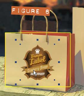 With the Selector tool, move the label to within the rectangle, scaling it if necessary—drag a corner selection handle toward the center of the shape to proportionately scale something. Here’s your big chance to determine the position of the label relative to the front face of the bag. Take your time; this isn’t one of those overly fast videos Bouton usually does. See Figure 6.
- Marquee select both the label and the rectangle (diagonal drag across the outside of both shapes) using the Selector tool, and then press Ctrl+G to group the two shapes.
-
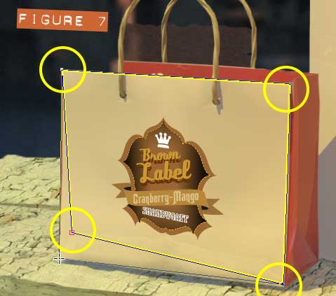
With the Shape tool (the Shape Editor tool in previous versions), one control point at a time, drag each point to the respective corner of the bag, as shown in Figure 7.
- It’s not possible to select inside a Mould, as you’d Ctrl+click inside a group in Xara. Nor is it possible to see a bitmap in Wireframe view quality, so you cannot really assign the outline outside the logo no width and edit in Wireframe. Which leaves you with the outline to remove. The solution is to duplicate the Mould shapes—right mouse button dragging and then a release moves and creates a duplicate (known as “dragging a copy”). Now you have a Mould group of shapes for backup; you now select the original and then press Ctrl+Shift+S to Arrange>Convert to editable shapes. The Mould is gone in the original and it’s just a group of shapes now.
- Ctrl+click the outline with the Selector tool, and then either press the keyboard Delete key or Backspace to remove the outline.
- Take a breather for a sec’. You’ve done great!.
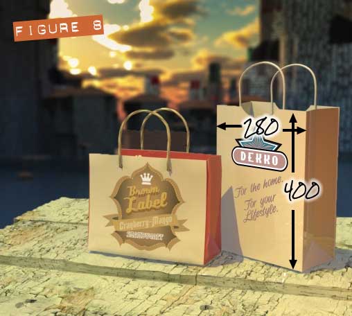
I think you really should try to add the “Dekko” logo to the right bag for practice. This bag is severely tilted to the left along its Y rotational axis, as defined in most modeling and other 3D programs, and I’ll explain more about rotational axes in a moment. Okay, I believe it is reasonable to expect, if you’re creating a label and pre-visualization for a client on one of their bags, that they tell you what the dimensions of the bag are. Fair? This second bag, shown completed in Figure 8—and yes, you can guess the dimensions if you’d like to try working without a safety net—is 400 units high and 280 units wide on its front face. You can create a rectangle by first dragging one and then entering these values in the Infobar’s dimensions fields. And then you can scale the rectangle up (or down) to more or less fit the front face of the second bag.
You repeat the previous steps and before you know it (or exactly when you know it), you have a handsome prototype for a client’s production line.
Using a Grid and 3D Text
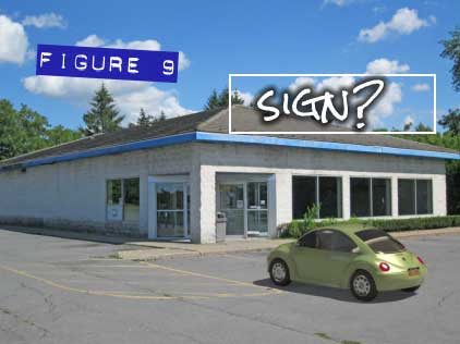
We have a few inches left on the bottom of this HTML document, so I’d like to show you another example of ingenious perspective use. Let’s say you have a photo like this of a well-kept, but abandoned storefront. As you can see in Figure 9, this is an ideal opportunity to previsualize a new store in this photo, and all you have to do is create new signage and then use the correct perspective to put the new sign in, not on, the photo.
I have a gift for our membership: it’s a grid that is just a little wider than a 4:3 aspect ratio and you’ll use it in this next assignment to create a perspective plane that not only matches the front of the vacant store, but also extends above the store front so you can put fancy extruded text above the windows. This is actually where the original sign was in this scene.
The steps to follow make use of the Extrude tool in Xara, and I’ll show you how to line up the edges with the proper perspective plane shortly.
Ready for some fun?
-
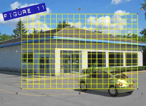
Open the Perspective grid.xar file, Ctrl+C to copy it while it’s selected, and then in the MT Store.xar document, press Ctrl+V to paste the grid on top of the photo. This grid is all shapes, no lines, so when you perform a Mould operation on it, it really does distort as you’d expect it to. However, you might in this example change the color of the grid to a bright yellow so it’s quite visible against the photograph. See Figure 11.
-
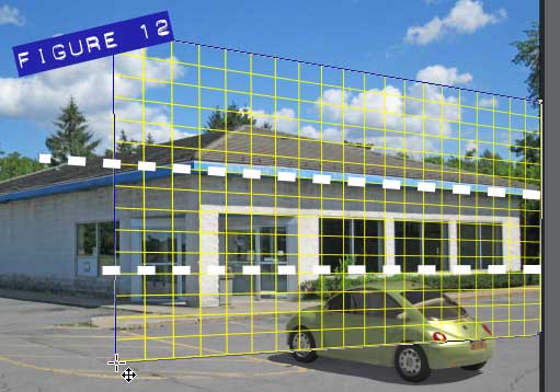
You might want to either turn off the Object Edit Handles by clicking the button on the Infobar, or press Ctrl+G to group the single shape so adjusting it with the Selector and other tools doesn’t accidentally move the control points on this complex object. Move the grid over to the right of the photograph, choose the Mould tool from the Toolbar, click the Default Perspective button on the Infobar, and then with the Shape tool (because the Mould tool is a little imprecise when moving Mould control points), drag the top and bottom left handles, and then the right handles, until you have the grid over the photo in such a way that the blue trim on the roof and the bottom of the windows coincide horizontally with two of the horizontal grid lines, as shown in Figure 12. I’ve put two wide dashed lines across the areas you should be matching in this figure. Now, whenever you adjust one control point in a Mould, you need to compensate and go back to the opposing point(s) and re-adjust them, so take your time; the top portion of the grid is where the 3D text will go.
-
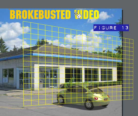
Okay, it’s fairly obvious for those members in the States which video rental place I’m making fun of. FYI, their logo uses ITC Machine. If you do a Google search for the font, I’m sure you can find it. Now, one of the things I do when adding an illustration to a photo to make them blend a little better is to use a slight gradient. Always keep your fills “moving”; in real life there is usually a perceptible light fall-off and in this scene, the sun is coming in at the right. Figure 13 shows my text, and as you can see, it has a linear gradient from a lighter gold to a deeper one.
- With the text selected, choose the 3D Extrude tool from the Toolbar, and then force a temporary extrusion to get our creative process started by dragging on the face of the text. You’ll change the angle and depth in a moment.
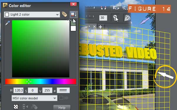
- Click the Show Lights button on the Infobar. You’ll notice one of the three lights is a dull green toward the right and this is an okay color for abstract and general compositions, but this is supposed to be a sign on a building on a sunny day. In other words, a green light is terrific for traffic signals but not so good in this scene. Select the light icon in the scene and then open the Color Editor.
-
In the Color Editor, use the drop-down list at top to find Light 2; it’ll have a green swatch to the right of its title. In the color field, drag the marker to white, as show in Figure 14, and dah-dah! The extruded text fits a lot better within the scene.
-
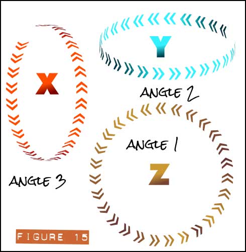
It’s Diversion Time because I need to show you how Angle 1, 2 and 3 can be used on the Infobar drop-down list when you’ve extruded something. These guys represent rotational angles but they do not correspond to the X, Y, and Z axes of modeling programs. Here’s the deal: Figure 15 shows rotational axes as they are represented and used in Blender, 3D Studio, and other modeling programs. You know how you measure Xara’s page from left to right in a direction we usually call “X”? Well, put a ring around that X direction, and this is the rotational axis of the Angle 3 entry on the Infobar drop-down, more or less the direction in space of a Ferris wheel. The Y rotational axis corresponds to Angle 2, and looks a little like the 3D space direction of a Merry-Go-Round (a Round About). Finally, Angle 1 is the Z rotational axis, parallel to the page. And actually, you can just use the standard rotation handles on an extruded shape if you only want to adjust Angle 1 (the Z rotation). Finally, and important point here is that if Angle 2 is set to zero on the Infobar, the other two axes will not rotate exactly as you’d like or expect them to. So when dealing with extruded text, give Angle 2 about a 2 degree turn and your editing work on rotational orientation with extruded text will go peachy fine.
- First, right-click over a deep blue on the color line and choose Set Line Color. Now, the sides of the sign the audience can see will be authentic Bankrupt Blue.
- Position the sign over the top of the building, with its base more or less touching the blue horizontal strip in the photo. Use the Angle 1 slider after choosing this angle on the Infobar drop-down to adjust the top-to bottom rotational amount. The front-back rotation value that worked best for me when I ran this tutorial was 12. But bear in mind that the other two axes’ rotations affect the final value of the 3rd. 3D space is tough to navigate and you can imagine the occasionally humorous mishaps on the International Space Station.
- Set the parameter for rotation on the Infobar’s drop-down list to Angle 2 to adjust the left-right rotation of the sign. This will be a significant amount of rotation because the front of the building is in perspective the most. I did well with -24. Just drag the slider ever so slightly, request to the engineers that they put elevator buttons on these sliders in Xara version 10 for tapping on, and don’t even try to manually rotate the selected text. Change the values if this text is not lining up with the perspective grid.
-
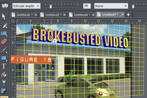
Finally, I found that the Angle 3 rotation of only 3 worked well, as you can see in Figure 16.
- I suggest that you set the Extrusion Depth to about 39 on the Infobar, and as far as the edges go, set them to None. The sides options you have in Xara are terrific for fancy print ads and T-shirts, but they detract from the photorealism you’re trying to achieve.
- You can delete or move the perspective grid now and there’s one last thing: add a Wall Shadow type shadow effect on the text: drag down and to the left a little to match the shadows in the photo. Then, with the Shadow tool still selected, set the Opacity on the Infobar to about 75% and the Blur to None—because this photo was taken on a sunny day, and none of the shadows in the photo are soft; they have sharp edges.
-
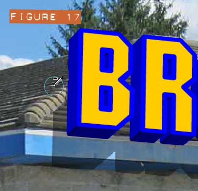
Okay, if you own versions 8 or 9 which have the Eraser tool, hit Esc(ape) to deselect everything, and then with the Eraser tool, get rid of the wall shadow effect on the tiled roof, because it doesn’t belong there—the roof turns at an angle to the left and wouldn’t catch a shadow. If you’re working with a previous version of Xara, consider copying a small piece of the roof that isn’t shaded and then cover the shaded part with this replacement bitmap. See Figure 17.
-
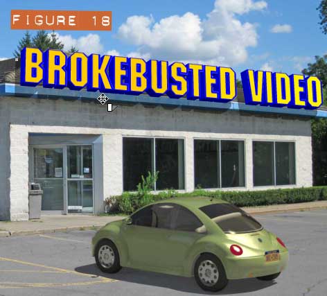
You’re done. I’m done, and this spanking new store looks like it’s all set to go out of business. Even when you have a good perspective on things, they don’t always go as planned. Check out Figure 18.
Be sure to post your perspective signage work in the Talkgraphics.com thread, July 2013 Tips and Tricks: How to Draw a Photorealistic Bottle Cap.

has been drawing with traditional tools for almost 40 years, and with digital tools such as Xara for close to 20. As large a fan as he is a practitioner, Gary encourages others to express themselves artistically through his writing, the over 25 books on graphics he’s had published, through the videos and tutorials he creates for The Xara Xone, and through his online school, Exclamations. You can send him some email, visit his personal website, or better yet drop on over to the Xara Xone Forum on TalkGraphics and talk to Gary and the rest of the Xara community.
The tutorial Packaging and Perspective including the artwork and the downloadable examples file are Copyright © 2013 Gary David Bouton. All Rights Reserved.