

Using These Free Textures in a Novel Way
by Gary Bouton (Gare online)
No, you’re not going to write a book with these textures. “Novel” when used this way, means, “unusual, unexpected, delightful, something Bouton thought up”.
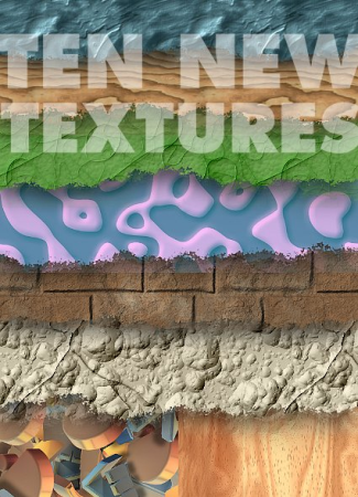
Seamless tiling textures like this month’s ten, are not only useful for making borders around page layouts and filling inspired illustration characters, but they can also be used to put surfaces on shapes that look 3D. All you need to do is create a simple extruded shape (such as the square in this example), pose and light it, and then trace over it so you can then snap textures to the interior sides of the closed shapes.
Okay, enough with the introduction! Download (about 6MB) and open WoodenBlock.xar from this month’s Bonus zip archive if you want to get right into the action, or open a new document and then bring in Light Procedural wood.png and set it aside for the moment.
Making a 3D “Study” for Your Work
The Extrude tool isn’t just an Eye Candy Factory for interesting shiny protruding shapes; you can also learn from simple examples and actually make great drawings not with the Extrude tool, but by emulating what you see when you use the tool on different shapes.
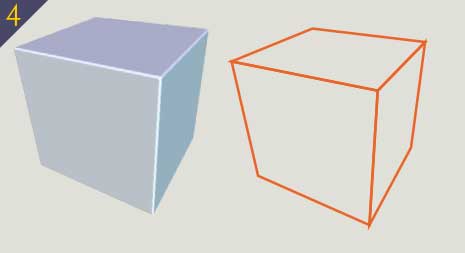
This month, I want you to make a wooden cube, posed in a way such that you can see three of the six sides, with perspective that suggests a wide angle lens was used to photograph the cube, and that there is a different degree of lighting on each side. Is that asking too much? Nahhh! Follow along here:
-
With the Rectangle tool, hold Ctrl and then drag a square of about 250 pixels in length. The CTRL key constrains rectangular shapes to be square ones, just like it constrains ellipses to perfect circles when you use the Ellipse tool. Ya gotta have CTRL to be a great artist!
-
Fill the square with 20% grey. This color is good because when the square is extruded to become a cube, it should be fairly easy to light it to produce three different shades of color, thus more interesting and a little more photorealistic then you’d expect.
-
Choose the Extrude tool from the effects flyout on the Toolbar, and then drag down on the face of the square to produce the extrude effect; the cube is going to be facing downward, which is correct for our purposes here.
-
Now, hover your cursor around the back edge of the extruded shape until the cursor changes from a little block with a four headed arrow to a little block with a two headed arrow—this is the mode of the Extrude tool that lets you increase or decrease the depth of the shape when the back lip of the extrude is visible. Drag the edge “backwards”, away from the front, until you have what appears to be a cube—all three dimensions basically look the same.
-
Play with the angle of rotation of the cube by dragging on the front face with the Extrude tool—the tool’s cursor should have the four-headed arrow. Pose the cube so it will be interesting to surface it with the wood later.
-
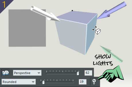
To assist in enhancing the look of your “study object” choose Perspective” from the Extrusion parameter drop-down list on the Infobar, and then crank it up to 62 or so.
-
By default, the bevel that connects the edges of an extruded object is Smooth. This is good, but you only want a little of this effect so you can clearly see the edges of the cube as highlights regardless of the lighting, so drag the Bevel type slider down to about 18 or so.
-
Click the Light button on the Infobar so the light source indicators are visible and can be moved around to change the lighting on the cube. In Figure 1, you can see that the left face is lightest, the top darkest, and the right side a shade somewhere in-between. Move the lights around until you’ve basically achieved this effect, or use the bonus file as the completed study. Save this file, take a short break, and when you come back, it’s tracing time.
Making a Vector 3D Cube
For the next set of steps, I’m going to ask you to enable Snap to Objects, that horseshoe magnet icon on the Standard bar. It’s important to know (or remember) that snapping to the vertices (the control points) of objects is not a guarantee that what you draw is perfectly incremental or aligned or anything, but instead what you drag to a snap point accomplishes the effect—you drag to a control point to make it snap. And this means when you’re drawing with say the Shape tool, you begin with a shape that has control points at its corners. Then, when you begin to draw a second shape—you’ll be drawing three faces of this cube—you click a point, click a second point near the first one and then click-drag that second point to the point on the other object where it should coincide. You release the mouse button when the horseshoe magnet appears near your cursor.
Ready to replicate this Extruded cube?
-
With the Selector tool, right-click over the extruded cube and then choose Lock Extrusion from the contextual pop-up menu (no two companies agree on what this menu is called).
-
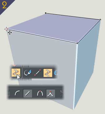
Choose the Shape tool from the drawing tools flyout on the Toolbar, and then on the Infobar, click the Line button and the Cusp button as shown in Figure 2. This will make the Shape tool (shown above the Line and Cusp buttons in Fig. 2) produce straight line segments just by clicking a point, moving to another corner of the underlying extrusion study, and then when you reach the first point, clicking over it closes the path and you have a shape that can be filled with a solid, a gradient, or in this example a bitmap fill.
-
You might want to click the No Fill swatch to the left of the color palette swatches now so you can see what you’re tracing over, and Shift click over a light green or even white on the color palette to make your outline really contrast against the underlying extrude, again, to better be able to see what you’re doing.
-
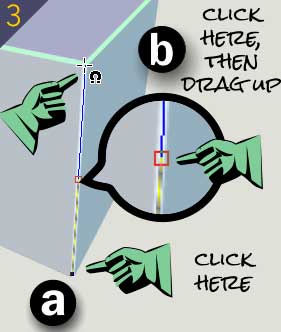
Begin the next closed shape by clicking a point at the far side of the first shape (Figure 3), click another point that doesn’t quite meet the corner of the first shape’s corner, and then drag the end point to the adjoining corner of the first shape. This is how you get the snap-to feature to work for you with precision.
-
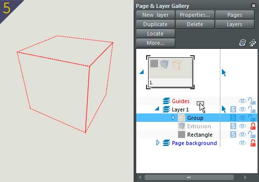
Once you’ve drawn the three sides, these three closed shapes will serve as a snap-to template for adding the wood texture—because you can’t use the Snap to Objects feature using an extruded shape. Marquee select the three shapes, and then press Ctrl+G to group them on what is Layer 1 on the Page & Layer Gallery—which you should open right now. If it’s not docked to the right edge of the interface, press F10 (Utilities>Galleries). Figure 4 shows the template you’re now going to move to the Guides layer.
-
Expand the list of stuff that’s on Layer 1 on the Page & Layer Gallery. See the “Group” entry? With the Selector tool, move that entry up to the Group entry, as shown in Figure 5. A cursor with a tiny rectangle representing objects indicates when your cursor is in position to drop the Group entry over the Guides layer to move it. Once it’s been moved and the group looks like a collection of dashed lines, lock the Guides layer, but leave it visible and then click on the Layer 1 entry to make sure your next edits are being done on the correct (and unlocked) layer.
Stretching Wood
You’re probably familiar with the Mould tool, and the Perspective feature, especially the Fereeform mode, would seem to be the logical choice now for matching copies of the Procedural wood PNG file to the three shapes that represent the sides of the cube.
But it’s not, for two reasons, in this example. First, this month’s Giveaway consists of seamless textures that can be tiled within an object 2 or more times. You’d have to tile and calculate how large a shape you need were you to use the Mould tool’s Perspective mode to accomplish essentially the same thing using a much more crude and effective technique.
When you import a bitmap, and then drag it into the page, it exists as a bitmap, but in reality, it’s a single tiled fill of a shape in Xara, and that rectangular shape can be changed by dragging on its control points, specifically in this example, to the four points of each face of the cube! Okay, this magic is a little more involved than it sounds here, and that’s why we have steps to follow:
-
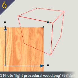
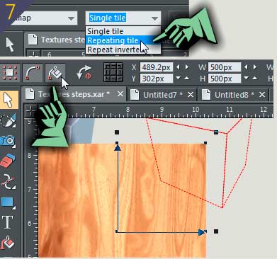
Select the Procedural wood PNG file and move it close to the cube guide, as shown in Figure 6. Now to get this chunk of wood texture looking as though it’s in perspective and on the left side of the guides template, you’re going to have to a.) Go to the Infobar while the PNG wood is selected and the Fill tool is your current tool, and then choose Repeating tile from the Fill Tiling drop-down list. When you distort bitmaps as you’re going to do shortly, absolutely nothing is visible when you drag a control handle away from the enclosed bitmap. But if you tell Xara to repeat the tile, everything is fine, particularly because this bitmap was carefully designed to repeat without tell-tale edges in the pattern. b.) You need to have Show Fill Edit Handles enabled up on the Infobar, also called out in Figure 7. This needs to be done while the Selector tool is active; it’s not visible on the Infobar when the Fill tool is active.
-
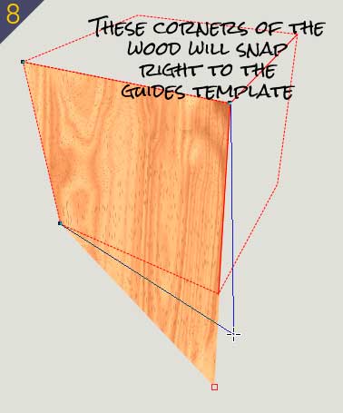
Here’s the cool part: if you use the Pick tool very carefully and deliberately, you can use it, one corner point at a time, to drag the corners of the bitmap wood up to the corresponding corners of the left side of the Guides cube template. Otherwise, you can use the Shape tool to perform the same thing with a little more certainty. See Figure 8>.
-
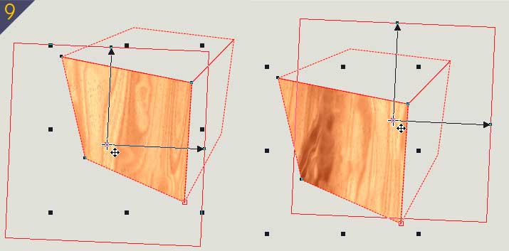
And now that you have the left piece of wood in place—and do notice that the bitmap is in perspective, a terrific photorealistic effect— you can use the Edit Fill control handles to shift the wood pattern by dragging the center control handle, and even scale it a little using the ends of the handles; See Figure 9.
-
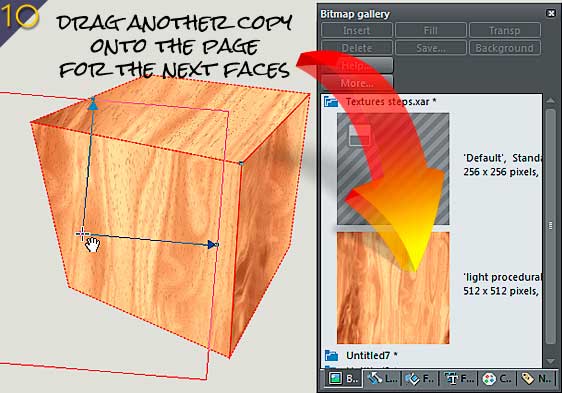
You have the original wood file in your Bitmap Gallery (Press F11), so open it and drag a copy onto the page.
-
Repeat steps 2 and 3 on the two remaining faces. When you’re done, take a break and see what’s in the fridge that looks good, and then when you come back, check out Figure 10; you’re almost done, and a little shading awaits you.
Detailing Your Wooden Cube
The cube itself looks great right now, especially if you go to the Page & Layer Gallery and lock and make the Guides layer invisible. But the composition still needs a little something to suggest where a light source is coming from, to make the wood fills just a little different in lightness values and this also helps separate the three pieces visually.
-
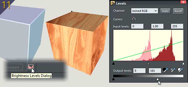
With the Selector tool, select the top shape. The extrude cube you built earlier as a study, a reference, suggests (okay, it declares!) that the top of this cube is the darkest, so with it selected, go to the Photo tools flyout on the Toolbar and then choose the Photo tool, the icon that looks like a pastel blue camera. This causes the Brightness Levels dialog to appear.
-
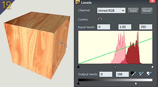
To make the selected top piece darker, drag the white point slider in the Output Levels slider, the guy on the bottom of the panel, not the sliders below the histogram, to, oh, say, about 61 (drag left), and as you can see in Figure 11, the wood still looks like the same type of wood as the other shapes; it’s just not as brightly lit.
-
Do the same thing to the right side, but only decrease its output brightness level to about 160 or so, also shown in Figure 11. You will notice that every time you select a different shape to use the Brightness Levels dialog on, you need to go fetch the Photo tool again, a mild inconvenience considering the magnitude of quality work you’re doing here.
-
Finally, select the left shape and with the Brightness Levels dialog, use the Input white point slider at right, and drag it just a little left to brighten the wood and to create just a little more tonal diversity between the three sides. See Figure 12.Now, group the objects, and believe for a moment you’re done.
Great Work Becomes Even Greater
I hate perfection in artwork because it indicates a level of perfection that is not humanly possible and therefore we as humans cannot totally connect with perfect art. Additionally, perfect artwork makes me jealous, I get depressed and then either want to out-perform this perfect artist, or just find a different profession such as garage mechanic work…which I understand is big money.
Okay, here’s a bonus trick for imperfecting the cube: you’re going to take a chip out of one of its corners and this is ridiculously easy to do if you understand lighting, or just have the patience to run a few more steps:
-
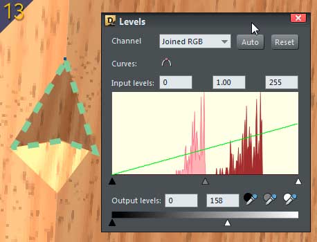
With the Shape tool set to Line and Cusp types on the Infobar, draw an upside-down, shallow “V” shape right (or sort of an upward arrowhead) on the front edge of the cube, (look ahead to Figure 13). Because the last shape you selected was the wood, the fill of this shape is the same wood you’ve been using.
-
Artistically, and somewhat photorealistically, this “dent should be darker than the surrounding wood because it dents inward and is partially hidden from the light. So use the Brightness levels controls, the Output levels white point slider, to darken it…which is also shown in Figure 13. Try to ignore my green dashed line callout.
-
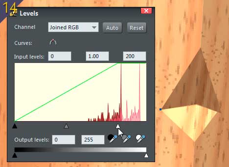
Create a diamond sort of shape below the arrowhead shape, the top two sides meeting the bottom two of the arrowhead. This is the opposing side of the ship in the wood, and unlike the top, it will receive light because it’s angle is in the opposite direction. With the Brightness Levels dialog, use the Input White point slider to make this shape lighter. Figure 14 shows this.
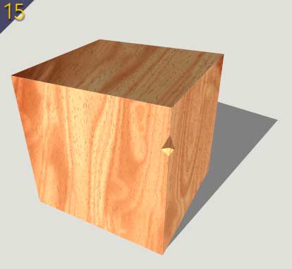
In Figure 15, I faked a shadow (I didn’t use a modeling program or a still life to calculate the shape or angle) and I consider the piece finished. And you should, too…congratulations!
People who know me (and still talk to me) understand that I have to get one last word in, so here goes: the pack of ten textures this month? This mini-micro-nano tutorial is an example of what you can do with only one of the ten textures I created for TalkGraphics members. Please see what you can do that’s interesting, bizarre, but not outright obscene with the other 9 and post your work on the discussion group!
Discuss this giveaway in the Xara Xone forum on TalkGraphics.com

has been drawing with traditional tools for almost 40 years, and with digital tools such as Xara for close to 20. As large a fan as he is a practitioner, Gary encourages others to express themselves artistically through his writing, the over 25 books on graphics he’s had published, through the videos and tutorials he creates for The Xara Xone, and through his online school, Exclamations. You can send him some email, visit his personal website, or better yet drop on over to the Xara Xone Forum on TalkGraphics and talk to Gary and the rest of the Xara community.