

A Tips and Tricks Tutorial By Gary David Bouton(“gare” on online)
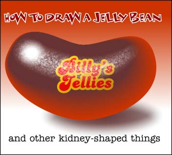
How To Draw a Jelly Bean
A jelly bean—or a kidney bean (or an actual kidney), or a lima bean—might not be the first thing a mature, emotionally well-adjusted adult sits down to draw in Xara, granted. However, this tutorial addresses at least two things that I don’t believe have been adequately emphasized in the past on The Xara Xone, at least not on my watch.
First, gradients are swell. One of our talents extraordinaire on TalkGraphics.com, Maya Doka, uses gradients and transparencies with fractal attributes on scores of shapes to build up a vector “painting”, heavily layered, exquisitely detailed. However, before multi-stage gradients were introduced to drawing programs, artists would use Blends to achieve airbrush smoothness, and one of the advantages of using blend steps between different objects is that you can control the shape of the transition from one color to another—you can use virtually any two shapes, and begin and end the blend anywhere you like. And this is what I’ll show you when you shade the jelly bean shape, which is neither plastic nor very reflective in its surface property.
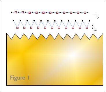
The second thing is that most of us are aware of the Nudge feature in Xara; you select a shape or shapes, and then use the keyboard arrows to move these shapes into the exit position you need. But did you know that you can also nudge control points? Yup: you select a control point along a path, press the arrow keys, and you’ve achieved a very sophisticated and precise transformation of the shape itself. You could make a pinking shears shape in Xara simply by evenly spacing your control points, Ctrl+clicking every other control point to select every other one, and then nudge the points down a little, as shown in Figure 1.
So enough texting and onto teaching. Get out a fresh sheet of paper in Xara, and follow along here:
Making the Jelly Bean Shape
If you think about it, a bean shape is just a circle that has elastic properties, and someone came along and sat upon it. That is, three of the four control points on a circle shape; at 3, 6, and 9 o’clock remain fairly static, while the 12 o’clock position travels in a down direction. Let’s get to it, beginning with a simple circle:
-
Choose the Ellipse tool, hold
CTRL(constrains the proportions of the ellipse to a perfect circle), and then drag diagonally (down and right) until the size of the circle is about250 pixels, as shown in Figure 2. While the circle is still selected, along the circle itself you’ll see four control points at 12, 3, 6, and 9 o’clock. Make the circle white with a 1 or 2 pixel outline to see the control points better.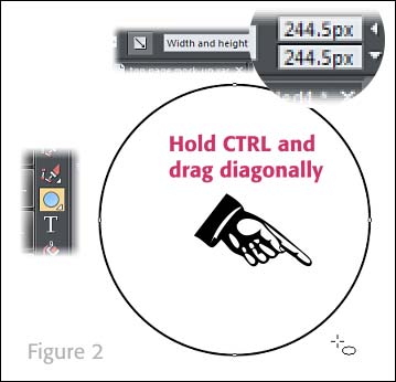
-
Choose the Selector tool and select the circle. Now, you want to put a dent in the top of the circle to make the jelly bean, but surprise—an ellipse is a QuickShape and messing with the control points will only, for example, return an ellipse to a circle when you double-click any control point. Instead, with the guyt selected,
press Ctrl+Shift+Sto Arrange>Convert to Editable Shape. Or if you have your workspace configured similarly to mine, I’ve got the Convert to Editable Shapes button on my Standard Bar, as shown in Figure 3.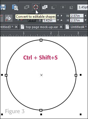
-
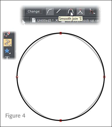
With the Shape tool, marquee-select all four control points. You’ll see on the Infobar that you can elect to change the type of connections these control points have as the curve path runs through them. By default, when you make a circle editable, all the control points have a Cusp connection—the control handles sprouting out of the control point can be moved independent of one another. Which is not what is needed here—the former circle needs to have Smooth nodes at all four sides. You can see in Figure 4 that there is a slight change to the circle once the control points are changed to Smooth—the gray overlain circle is the result of the conversion. This is negligible as far as the tutorial is concerned, but it might be a fun fact to discuss over coffee with someone.
-
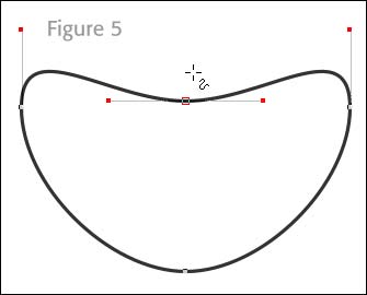
Here’s the Big Deal transformation step: click the top (the 12 o’clock) control point with the Shape tool, and then use the Nudge feature by tapping the down keyboard arrow several times until you get a shape that’s jelly beanish, but not perfect yet. See Figure 5.
-
The problem with the shape right now is that the 3 and 9 o’clock control points’ control handles are perfectly vertical and they aren’t exactly far enough away from their control points. The farther a handle is from its point, the greater the related curve segment is drawn away from its origin.
Click the control point with the Shape tool, and then move it—either with keyboard arrow keystrokes or just dragging it, so that it represents a hypothetical end point for a curve running through the center of the shape—the blue dashed line in Figure 6.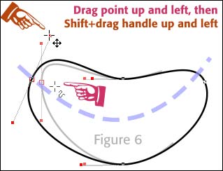
-
Keeping with Figure 6, now you want to
click either of the left control point’s handles, hold Shiftwhich makes the opposing handle automatically mirror what you do with the one you have selected, and thendrag up and a little to the left. What is does is bulge the end of the jelly bean, because the end was looking a little banana shaped when you just moved the control point in Step 5. -
Repeat Steps 5 and 6 with the right control point, the one at 3 o’clock. In Figure 7, you can see the shape we need in this tutorial, and it’s also included in the file you downloaded. Also, fill it with the Web’s hexadecimal color
cc3300—you can copy the value right here and then paste it into the Color Editor’s Hex (#) box while the bean shape is selected.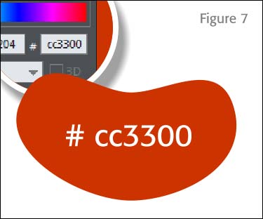
Shading the Jelly Bean
Earlier I mentioned that you’d be using a Blend to add shading to the jelly bean. I actually bought a scoopful in the bulk foods section, and used single source lighting against a white piece of paper and studied the darned fool thing. I discovered some artistic artifacts you should appreciate and use in this piece, and perhaps others of your own in the future.
First, anything sitting on paper white is going to cast some “color bleed” into the shadow. Now, this jelly bean is going to be dark cherry in color so two things will happen at lower right if we define the light source as coming from upper left. First, the shadow is going to take on a slightly reddish tint in the area closest to the bean, spreading out to a neutral color and then vanishing when the light angle no longer eclipses the bean.
Second, there will be a slight lightening of color at the lower right of the bean because light bounces. You’ve heard of diffuse lighting, lighting that bounces all over a bright-colored room? Diffuse light adds detail to every point in a given space, so bear with me when I tell you that the bottom right of the bean is slightly illuminated by the paper white it rests upon, which in turn is illuminated by the single source light.
This is easier done than said! Follow these steps to begin the Dark Cherry jelly bean adventure:
-
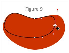
With the red bean shape selected,
press Ctrl+Kto place a copy of the shape directly on top of the original. It’s a good idea now to remove the fill and give it a2 pt. black outlineso you can tell the difference between the shapes as you edit the top one. You’ll work on the black outline shape next -
With the Shape tool (or if you’re slightly masochistic like I am, with the Selector tool), move the 3 o’clock control point over left, then select the 6 o’clock point and drag it up, so the new shape looks something like that shown in Figure 9. The nice thing about working with control points that all have the Smooth property is that you can make dramatic changes to the path, and you don’t get kinks or awkward path changes at points. You can even move the 9 o’clock control point a little to the right; select it and then use the nudge technique with the arrow keys.
-
With the black outline clone shape selected,
press Ctrl+Eto display the Color Editor and then humor me and accept this value to type into the Hex box: Area code (217) I’m kidding&hellip:type 663333. Now get rid of the black outline. Choose None from the Set outline width box on the Standard Bar. -
Choose the Blend tool (in version 10) from the group on the toolbar I guess you could call Modifier tools; they include the Contour, the Mould and the 3D Extrude tools.
-
Drag from the deep red shape on the bottom of the two shapes to the darker, smaller shape. It is very important that you drag from an outside shape to an inside shape. If you do the opposite, Amazon will bill you for a seven piece Samsonite luggage set, or at very least the Blend operation will not work. See Figure 10. By default, you can see that there are 5 intermediate shapes created when you blend two shapes.
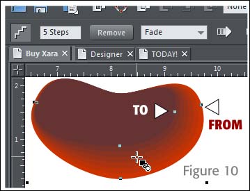
- You can see in the previous figure that 5 blend steps don’t produce a nice smooth transition like gradient fills do. The solution is exquisitely simple:
type 20 or 25in the Steps field and then press Enter.
The shading looks great. Now how about some highlights?
Adding a Specular Highlight
On a rounded surface that also has some horizontal stretching because it’s simply not a sphere, this bean shape, because it needs to be shiny but not very reflective, needs a white highlight, not in the shape of an oval or a circle, but of sort of a comet—a large round head at left where the lighting is aimed, decreasing in size and opacity as sort of a smear across the top of the body of the bean.
Additionally, this jelly bean is small, right? Larger than an ant, but smaller than a VW Beetle, right? It will therefore have very, very small bumps as a result of manufacturing conveyor belts bopping the soft snacks around. Now if you combine almost invisible micro-bumps with an area that has a highlight, the effect is a fractured, semi-distorted specular highlight. And to accomplish this effect, you’ll use a fractal transparency fill on the highlight you create. It’s gonna look terrific, trust me:
-
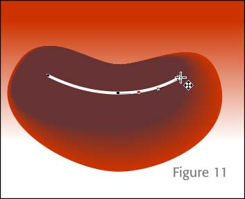
Choose the line drawing tool of your choice; the Shape tool will work here. Starting at the upper left of the bean, click points to create segments that form an arc around the top portion of the bean, as shown in Figure 11. Make sure the color of the outline is white.
-
Open the Line Gallery, unfold the Stroke Shapes section and then with your curve still selected, double-click the Fallout preset,
increase the line width to 64 pixelsand then choose the Set Line Cap drop-down box on the Gallery to Round Cap. See Figure 12.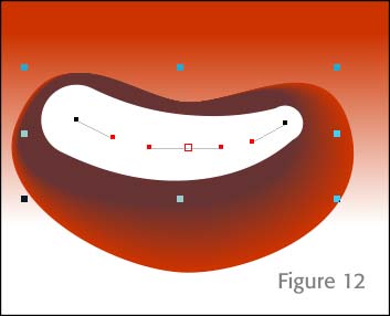
-
Choose Arrange> Convert line to Shape (or press
CTRL+SHIFT+S). The fat, tapering stroke is now a closed path, filled with white, the color of the former line. -
Choose the Transparency tool from the Toolbar, and then choose Fractal Plasma from the Transparency shape drop-down list. With either of the control handles above the shape, drag one toward the center of the two control handles until the grain of the fractal plasma is about the size of the asterisk on your keyboard. Then, crank up the
Feathering to about 29 pixels. See Figure 13.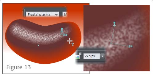
-
This might stray a little away from photorealism, but I feel there should be a slightly brighter specular highlight where the tapered stroke begins, with no fractal transparency. It helps set the composition off so it’s asymmetrical, and asymmetry is usually more visually interesting and sustaining than a perfectly symmetrical drawing. Create a circle about
65 pixelsin diameter, fill it with white, no outline, use the Feather slider up on the Standard Bar (usually), and set the value to about22 pixels. Then move the circle over to the upper left of the bean, as shown in Figure 14.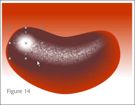
-
Ctrl+Sis probably a good thing to do right now; you’re almost finished. Take a 5 minute break while I put a new ribbon in my typewriter here.
Adding the Finishing Touches
I promised a cast shadow with some color bleed in it, and that’s next. After that, some mischief. I’ve included a typeface in the Zip archive called Candid.ttf—install it before continuing. This font is a knock-off I created of URW’s famous Candy font. I didn’t create all the characters, and if you like this font, by all means go out and buy URW Candy because mine is serviceable but not Pro quality.
You’ll notice that as you type just about anything with this font, it looks a lot like the logo to a famous jelly bean company. So I’m going to teach you how to make the composition look a little more photorealistic.
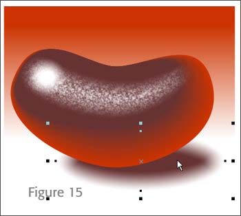
- Choose the Ellipse tool, and then drag an ellipse below and slightly to the right of the bottom of the jelly bean, as shown in Figure 15. With the Fill tool, set the Fill type to Elliptical on the Infobar. Click the center control point for the fill and then with the eyedropper on the Color Editor (or next to the Color Editor button to the left of the Color Line) drag up to the darkest part of the jelly bean, like at top left. This sets the core value of the fill.
-
Click the outer control handle for the fill and then click the
30% black swatchon the Color Line. Now you have a tinted shadow if you choose to set theFeather value to about 30 pixels. PressCtrl+Shift+Bto send the shadow back in shape order on the page until it’s to the back of the bean.On to the label for the bean now:
- Choose the Text tool from the Toolbar, and then type
Billy’safter clicking an insertion point anywhere on the page. Swipe (highlight) the text and then from the font drop-down list on the Infobar, chooseCandid. With the Selector tool, drag a corner selection handle until the text is comfortable to work with. You’ll scale it to its final size later. -
Fill the text with red. Now right-click and drag the word to below the original, and then release the right mouse button to “drop a copy” of the text. With the Text tool, highlight the duplicate Billy’s, and then type
Jellies. With the Selector tool, arrange both words so they fit vertically in an eye-pleasing way. C’mon, you’re the artist—I’m not going to tell you how to position text! Grin! -
With both words selected,
choose Arrange>Combine Shapes>Add Shapes*. The two words are now one shape and this will make the following steps easier to perform.
*There are only 52 keyboard shortcuts the average human brain can hold. Although Ctrl+1 is a simple shortcut for Combine Shapes>Add Shapes, it’s also the command for Change the default language to Esperanto in MS-Word. It is much less of a hassle subtracting from and adding to shapes, to go to Window>Control Bars> put a tick mark next to the Arrange entry, close the dialog box, and then dock the thing on the Standard Bar.
- Choose the Contour tool from the same tool group you took (and hopefully put back) the Blend tool. Click on the words shape and you’ll see tiny red arrows surrounding the shape. These are used to set an inward contour (you drag any one of them toward the shape) or an outward—the type you want—by dragging a handle away from the chosen shape. Drag outward on a handle until the onscreen preview shows about the same distance away from the shapes as the width of the apostrophe in Billy’s. Release the mouse button.
-
By default, there are 4 Contour steps, but you only want one because you want to run a thick, contrasting outline around the words, and the Outline feature in Xara widens in both an inward and outward direction, and you only want an “outside” outline in this logo.
Type 1in the Steps field on the Infobar and thenpress ENTER. -
There are three different ways a cap to a contour shape can be made: Miter, Round, or Bevel, as the button on the right of the Infobar illustrate. You want Rounded in this example, so make sure you’re still using the Contour tool, click the tool on the contour shape and not the words shape, and then
click the Rounded join button. -
With the contour shape still selected, click a deep yellow color on the color line or mix one up with the Color Editor.
-
Deselect the contour (
press ESC), and then marquee select the text with the Selector tool. PressCtrl+Shift+S(Convert to Editable Shapes), and the whole logo is now grouped, with shapes that have no special properties. This is good, because it’s hard to work with transparency and shapes that have dynamic links to other shapes or have other special properties such as leaping tall building in a single bound. See Figure 16 showing the key part of the Contour process.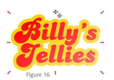
-
Drag the group of shapes over to the jelly bean, and then with the Selector tool, scale it down (or up if you worked real tiny) so it fits neatly in the center of the bean, with plenty of space around it.
-
Press Ctrl+Shift+B two timesso the logo is beneath the specular fractal filled shapes. The logo should looks as though it’s on the bean, not on top of the illustration. -
With the logo still selected, choose the Transparency tool; drag from about 11 o’clock to four o’clock on the grouped logo. The top left will be 100% opaque (which is fine as it is), to 100% transparent at bottom right, which is overdoing it. Click on the bottom linear gradient point and then on the Infobar, drag the Opacity slider to about
45%. In Figure 17, what you’ve done is not really suggest that the logo is transparent so much as suggest that its brightness falls off as the logo extends away from the hypothetical light source we’d agreed upon at the beginning of this tutorial.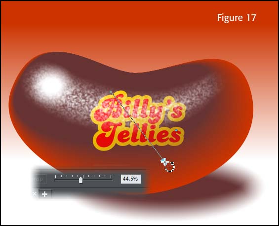
I hope you’ve learned a little about moving shape control points, the usefulness of Blends and contours this month, and as always, it’s bean a pleasure.
Discuss or ask questions about this tutorial in the Xara Xone forum on TalkGraphics.com.

has been drawing with traditional tools for almost 40 years, and with digital tools such as Xara for close to 20. As large a fan as he is a practitioner, Gary encourages others to express themselves artistically through his writing, the over 25 books on graphics he’s had published, through the videos and tutorials he creates for The Xara Xone, and through his online school, Exclamations. You can send him some email, visit his personal website, or better yet drop on over to the Xara Xone Forum on TalkGraphics and talk to Gary and the rest of the Xara community.
The tutorial How to Draw a Jelly Bean including the artwork and the downloadable examples file are Copyright © 2014 Gary David Bouton. All Rights Reserved.