How to start a font collection, what Bouton thinks you need, and where to start looking for fonts
Bouton’s Desert Island 20 Typeface Collection
by Gary David Bouton

I’m borrowing the setup to this article from just about every interviewer and game show host on the planet. “Gary, if you were stranded on a desert island and you could take only a handful of typefaces with you, which would they be?”
Which is a stupid question, even hypothetically, because I’d also need to take a PC, and a Linotronic imagesetter. And as hypotheses go, I’d much prefer to take a lifetime of groceries, an umbrella, my comfy slippers and the TV remote control.
Okay, a reality check tells us we’re not stranded, it’s 2012, and web fonts are practically dropping off palm trees. But your design life can’t consist of only free stuff you can scarf off the Web, nor can you get along with the default fonts that come with programs, or free fonts that are so elegant or grungy they’re only appropriate for a single design.
A Good Base Font Set
Let me suggest a good working set of typefaces that can address graphics needs in general, and illustrator’s needs specifically. If you have the right fonts on your system, you can do a little desktop publishing, although a professional DTP person would choose fonts differently than an artist, preferring typefaces more suited for body text than headlines.
Body Text Typefaces
Okay, let’s talk body text fonts first; fonts that can be used anywhere from about 8 to 18 points, set in columns using Xara’s column or rectangular font space definition.
There’s nothing wrong with Times New Roman, not for body text, it comes with Windows for free, and therefore it’s a little overused, but it’s clean, legible, and it has its own mostly overlooked elegance. If you’d like to go two inches off the beaten path of Times, you also have Linotype’s rendition of Palatino pre-installed with Windows. Palatino uses a snub serif at the end of character stems, and as Roman typefaces go—fonts whose stems can be thick or thin but not always an even stroke—Palatino varies less between thick and thin than Times does, and Times New Roman uses a cove serif, as you can see the difference here.
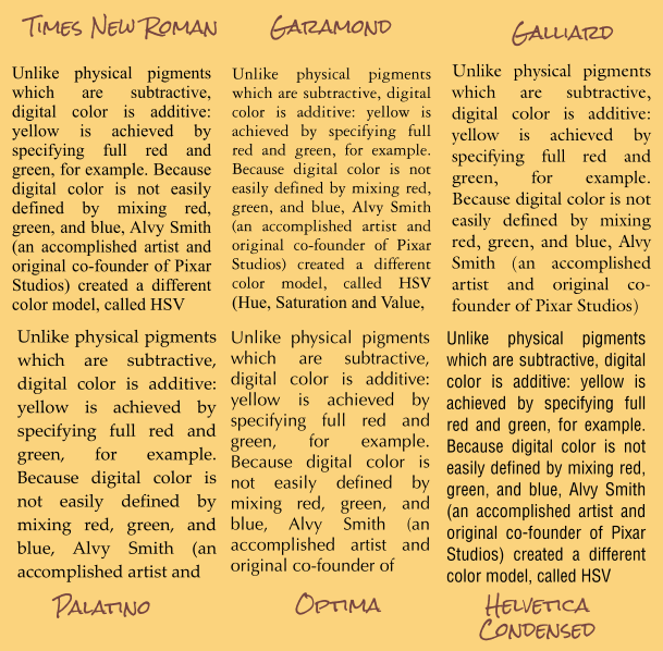
Above is an example of the body text typefaces I recommend, all set with the same text. Notice that because of the relative size and overall design of the fonts, some columns have more text in them than others. If you’re tight on space in a design, you might therefore consider Garamond.
If you have some bucks in your pocket and want to invest in a body text type font, Garamond comes in several renditions from Bitstream, ITC/Monotype, Linotype, Adobe Systems and others. Every font house renders a typeface a little differently. You’ll see in the illustration to follow that Garamond (normal) is lighter in weight than Times, so a page of body text will be less dense. This is called the color of a page, and some readers prefer a less dense font, actually providing better contrast on the page. When printing in Garamond, you use less ink than other fonts so Garamond might be considered eco-friendly. Although Garamond by its nature is highly legible onscreen and in print, purists believe it is the Stempel (foundry) Garamond rendition that is closest to the cutting of Jean Jannon, the first to realize Claude Garamond’s font in movable type.
One of my favorite body text faces is Galliard, created by Matthew Carter, the gifted font creator who also is responsible for the Snell Roundhand script font, Verdana, and Georgia web typefaces, and many others. Galliard seems to be related to Garamond, Palatino, and an older typeface classic, Souvenir simultaneously, yet manages to be its own thing. I’m often tempted to use Galliard at large point sizes for subheads in articles, because it’s both functional and distinctive. The italic version is absolutely stunning. It reminds me of the text font that the Hoefler Foundry created for Apple in the 1990s.
One other font strikes me as a basic font you’d want to have and use for body text, and unlike the others I’ve mentioned, Optima is a sans serif typeface; it has no strokes that terminate the stems of the characters. Optima is authoritative yet eye-pleasing, it holds up as legible text at small point sizes, and I believe (depending on the tone of a layout) you could use Optima as a headline, a subhead, and body text. Optima goes back to about 1954, and was designed by Hermann Zapf, who is responsible for the most-used set of dingbats in publishing history.
TIP: When you buy a typeface family—specifically a sans serif family such as Futura and Helvetica, buy a Condensed style font or two. Using Condensed family members will get you out of a jam when you don’t have a lot of space for body copy, and especially labels on packaging.
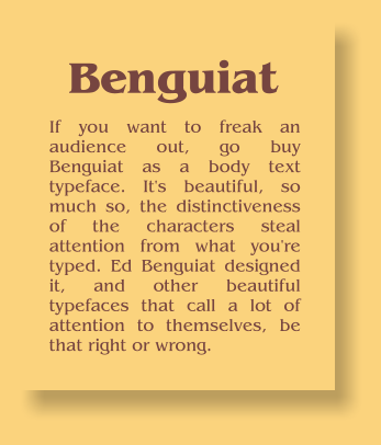
TIP: If you want to freak an audience out, go buy Benguiat as a body text typeface. It’s beautiful, so much so, the distinctiveness of the characters steal attention from what you’re typed. Ed Benguiat designed it, and other beautiful typefaces that call a lot of attention to themselves, be that right or wrong.
