Twelve Textures and One Creative Way to Use Them
by Gary Bouton (Gare online)
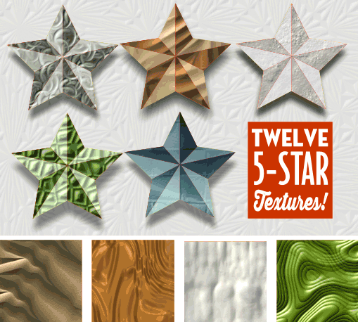
I’m always searching for unique combinations of pixels—a fancy way of saying “textures” here—that are useful in everyday work, that are useful exactly once in an over-the-top illustration, and occasionally the collections are of a more sedate theme so they can be used as borders for page layouts, and to see whether your living room can really withstand the color combination I sometimes use in stripe patterns.
This month, I just kicked loose and the dozen 512×512 pixel seamless tiling textures are Not of This Earth (I think that was an awful movie back in the 1950s): interesting color combinations, but mostly studies in extruding weird shapes. They’re odd, but in a pleasant way, and naturally some members will say “Oh, cool!” when they download them…and then file them away because there’s no specific project within which they can use them at the moment.
Surprise. Included in the Zip archive you might download (c’mon, please? I worked very hard on the images!), You’ll find a full-page Xara file that looks like this:
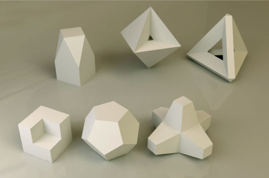
Notice that none of the shapes are curved along any axis: they are all planar, and what that means is that with any texture and the Mould tool in Default Perspective mode, you can surface each and every 3D shape if you’re so inclined. If you’re so inclined, here’s a tutorial on texturing a 3D render of a model, or a real photo of a cereal box, or my college roommate’s head, all things that are basically box-shaped:
-
Open the Planar Objects that need textures.xar file. The image is locked so you can work directly above it and skip using layers.
-
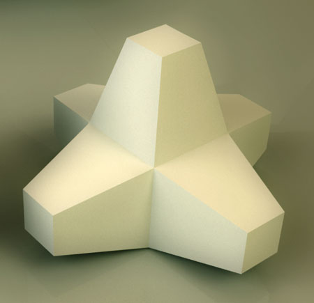
In this example, I’m choosing the lower right object, this guy here, that sort of looks like it fell off the International Space Station:
-
File>Import, and then choose any texture you like. In this example, I’m using Small Dragon Hide.png.
-
Now, you probably don’t want to use the entire tile, because in perspective and in place, the texture will be so small it defeats the purpose of this exercise and Good Art in general. So I’d say first of all, shrink the tile on the page to about 245 pixels square or so.
-
Second, even at the reduced size, you won’t be using the entire tile. Notice that the “arms” on this model are rectangular. With the tile selected, choose the Shape tool and marquee select two handles—the left top and the left bottom work here—and then use the keyboard arrow keys to nudge the selected handles toward the design until you have a rectangular texture.
-
Make a duplicate of the rectangular texture so you done have to fuss with scaling and cropping another copy by dragging the original out of the Bitmap Gallery and on to the page. The quickest way I know of to duplicate (“clone”) a selected object is to right-mouse drag the select by an inch or two in any direction and then release the button.
-
Showtime! Place one of the rectangles over the front, right face of the object. You might or might not want to use partial Transparency to align the tile’s corners precisely over the corners of the underlying model. I’m going to work without a net here—choose the Mould tool and then click the Default Perspective button on the Infobar. This is the “freeform” mode of the Perspective tool. You can drag any handle independently of the three others.
-
Click the top left handle on the Mouldy texture, and then drag it to the top left of the face of the underlying 3D model.
-
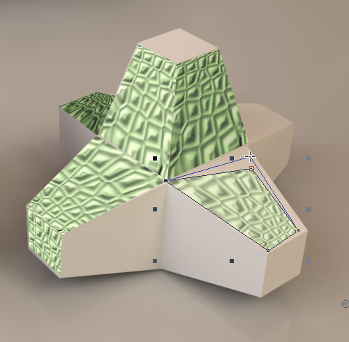
You get the rest of the steps; select the other Mould handles one at a time, and align them with the corresponding corners of the underlying face of the weird 3D object. Now don’t freak at some point of the textures disappears within the Default Mould box cradling it. All this means is that at a given point, one Perspective handle is so close to another one that the effect can’t or won’t be drawn by Xara’s rendering engine. You’ll see shortly in the figure below that all is well in this work-in-progress picture and all the textures are within Mould control boxes.
-
Once you’ve textured the underlying model, you’ll want to move the Mould objects away from the underlying picture for a moment. Here’s the deal: this weird 3D model is lit from upper left and you won’t wind up with a nice textured illustration if all the Mould textures are the same tone. So you adjust the brightness values of the Mould shapes to roughly correspond to the levels of brightness in the picture below your work. Choose the Enhance Photos tool now, the camera icon on the Toolbar.
-
Move, let’s say, two of the top pieces just a little bit away from their underlying, corresponding shapes, so you can clearly see that the left side of the 3D object is lighter than the side facing away from the light in the scene.
-
Choose the right side Mould shape; then go up to the Infobar and click the Levels icon.
-
Crank the midpoint slider to the right to make the midrange values in the bitmap darker. Then drag the output white point slider to the right, further dimming the selected Mould shape. See the image below.
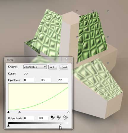
That’s the story! Perform the opposite step 13 on shapes that should be lighter—drag the black point output slider at the bottom to the right and drag the input midpoint slider to the left to make a piece lighter.
This is as far as I got:
Hey, have fun with this stuff. The real surprise is that you learn something by doing, and when you realize that, you realize that this stuff can be applied to other projects, and most of all, we have this preconceived notion that “Play” is fun, and “Work” is not fun. Work and Play might be opposites to some people, but there’s no reason on Earth why work can’t be fun.
P.S. Many of the planar objects in the rendered file in the Xara document were created using TopMod (Topological Modulation). The TopMod software is a free download thanks to the professors and students of the Department of Visualization and the Department of Computer Science at Texas A&M University and National Science Foundation.
…and the level of difficulty is up in the stratosphere, be forewarned.
Discuss this giveaway in the Xara Xone forum on TalkGraphics.com
has been drawing with traditional tools for almost 40 years, and with digital tools such as Xara for close to 20. As large a fan as he is a practitioner, Gary encourages others to express themselves artistically through his writing, the over 25 books on graphics he’s had published, through the videos and tutorials he creates for The Xara Xone, and through his online school, Exclamations. You can send him some email, visit his personal website, or better yet drop on over to the Xara Xone Forum on TalkGraphics and talk to Gary and the rest of the Xara community.

